Portfolio
Khoros Community
Khoros | Lead Product Designer, UX Strategy
Spring of 2020
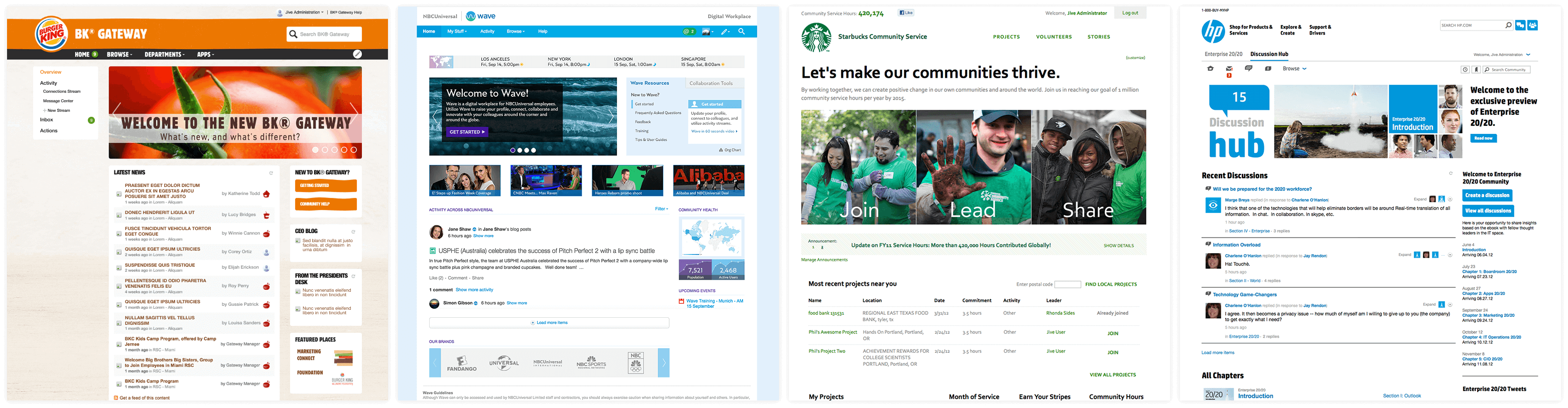
This was the transformation of a market leading SaaS enterprise community platform, code named "Aurora". Aurora brought a substantial cross-collaboration with multiple global teams across product, engineering, services, design and docs. We took this opportunity to start fresh with customer insights and data analysis across all of the features. This was also a time where we established a scalable cohesive experience based architecture with two design language systems to help support different roles and provide consistent reusable components.
Khoros Community
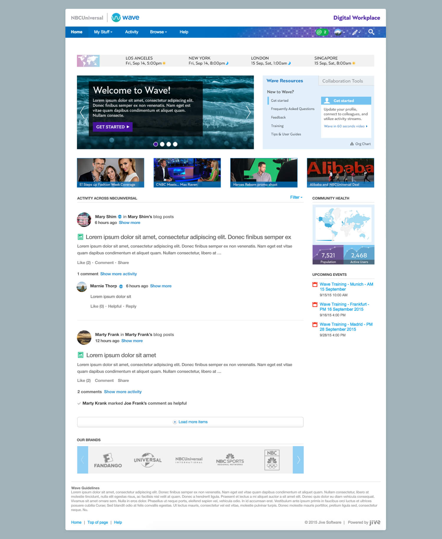
SaaS Community Platform
Project Overview
In early 2020, I joined a team of designers, product managers, and developers in a transformation of an enterprise community SaaS platform, a white-labeled product designed to be highly customized. I set out to question everything that was done in the previous platform and collaborate with cross-function internal teams as well as our customers to reimagine the next-generation digital community.
Challenge
Outdated platform with high costs of ownership, poor performance, and security issues. Customers felt the current platform had become unfocused, bloated, and were faced with a lengthy launch process and customization challenges that heavily involved support and services.
Solution
Design a new platform experience that aimed to provide a sleek, modern UX that adheres to community best practices while still giving brands the flexibility to make changes based on their needs. Modernize the overall product experience, improve moderation, and introduce self-serving tools.
My Role
I worked on this multi-year journey as a Senior and Lead Product Designer. As a part of my process I incorporated UX research, UX strategy, as well as UI design and prototyping in Figma and HTML/CSS. A few of the features I led discovery and design for were: content creation, management content, member authentication, knowledge base guides, value surveys, rule builder, dev-tools, and contributed to our design language systems.
My Design Process
Each feature in this transformation was looked at as a clean slate with the vision to what the consumer needed and expected. I concentrated on the desktop and responsive views, and accessibility functionality keeping a consistent experience through our design language systems.
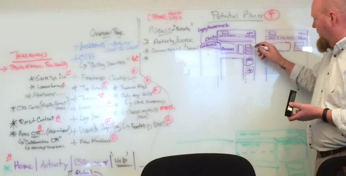
- Research & DiscoveryInitial kick-off discussions with the product manager and lead engineers as well as gathered data on competitive analysis, data investigations, analytics, and customer insight data reviews.
- Design IterationsMultiple design directions produced in Figma to which I would then lead discussions in design critiques for team collaboration, as well as keeping in constant connection with the product manager and engineers. Depending on the feature, I would also share with customers to walk through early directions and gather feedback.
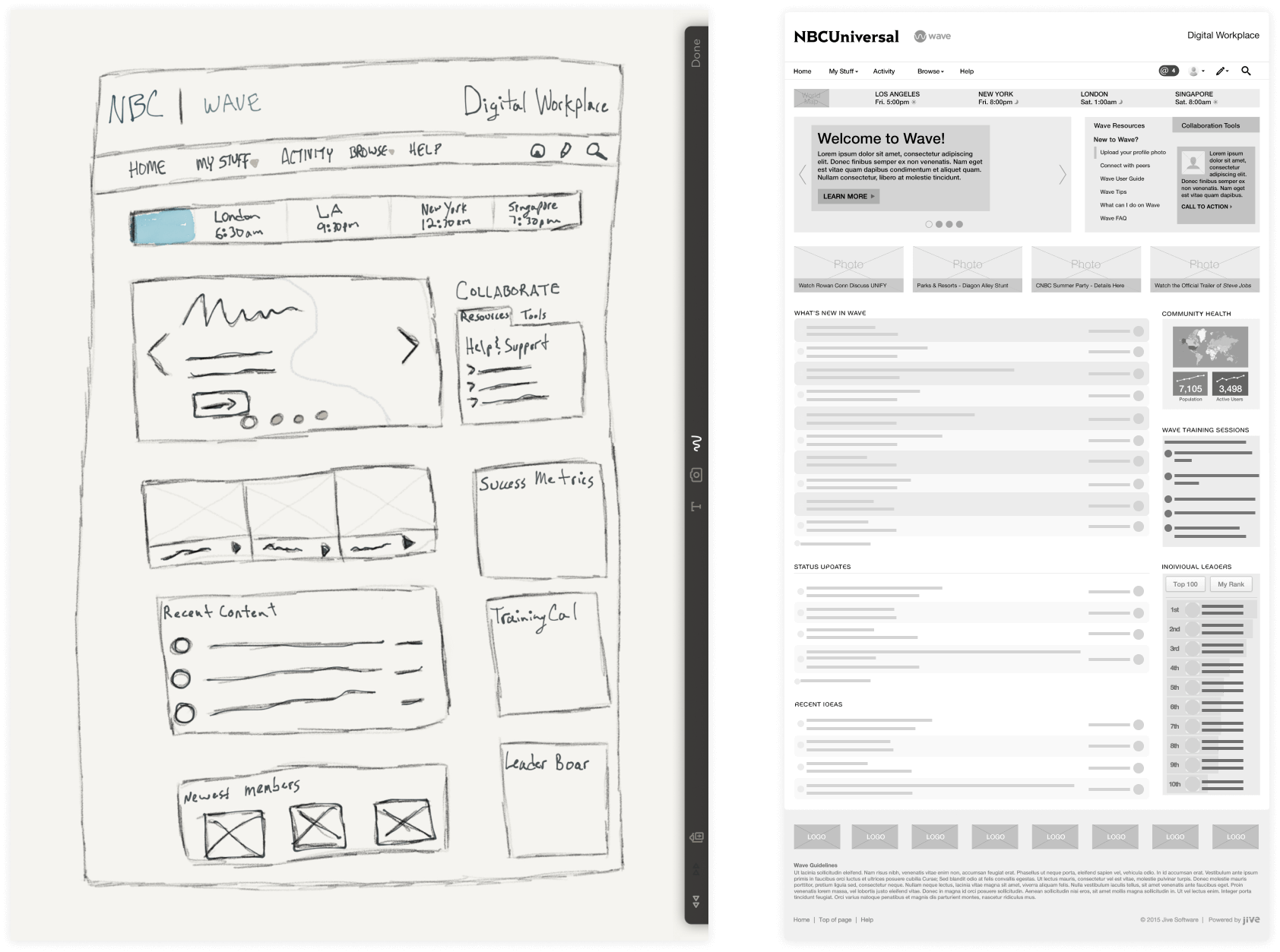
- PrototypingTypically I would produce prototypes in Figma to help explain the experience for internal walkthroughs and customer conversations. Some features would take a deeper dive into developing HTML and CSS prototypes for proof of concepts.
- Developer Documentation and Design HandoffsEach feature was then carefully documented in Jira and Figma for the engineer to follow.
- UX TestingAfter the feature had been developed, I then took the final step in the review of my features in testing for the overall experience, design pattern consistencies, responsiveness, and accessibility; passing back to the engineer if issues were found or moving to team review to be shipped to the customer.
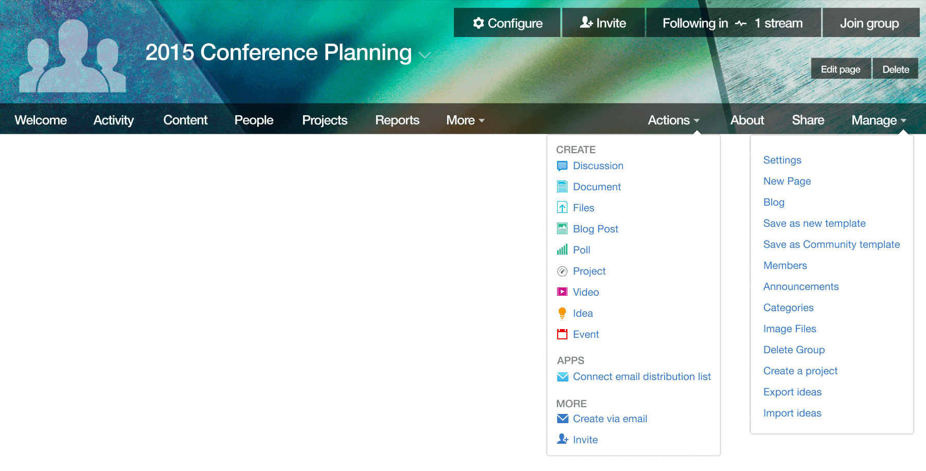
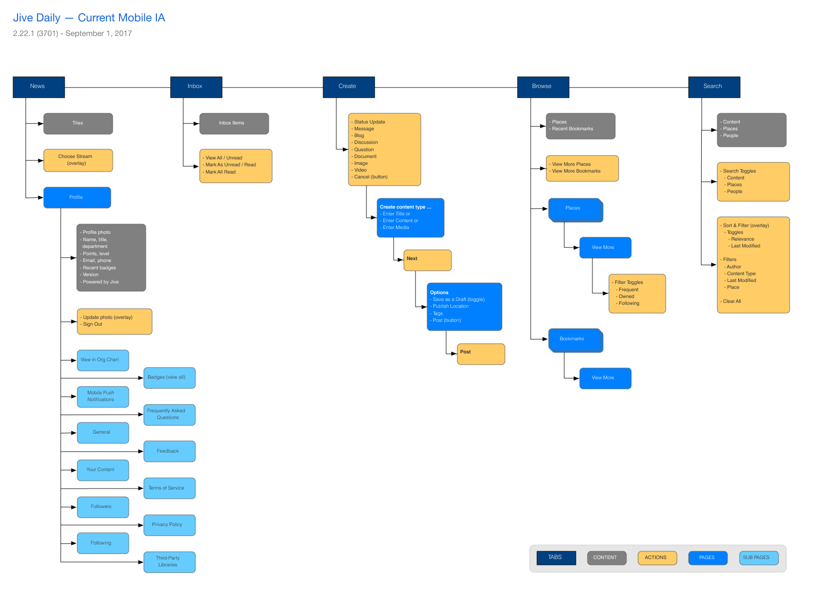
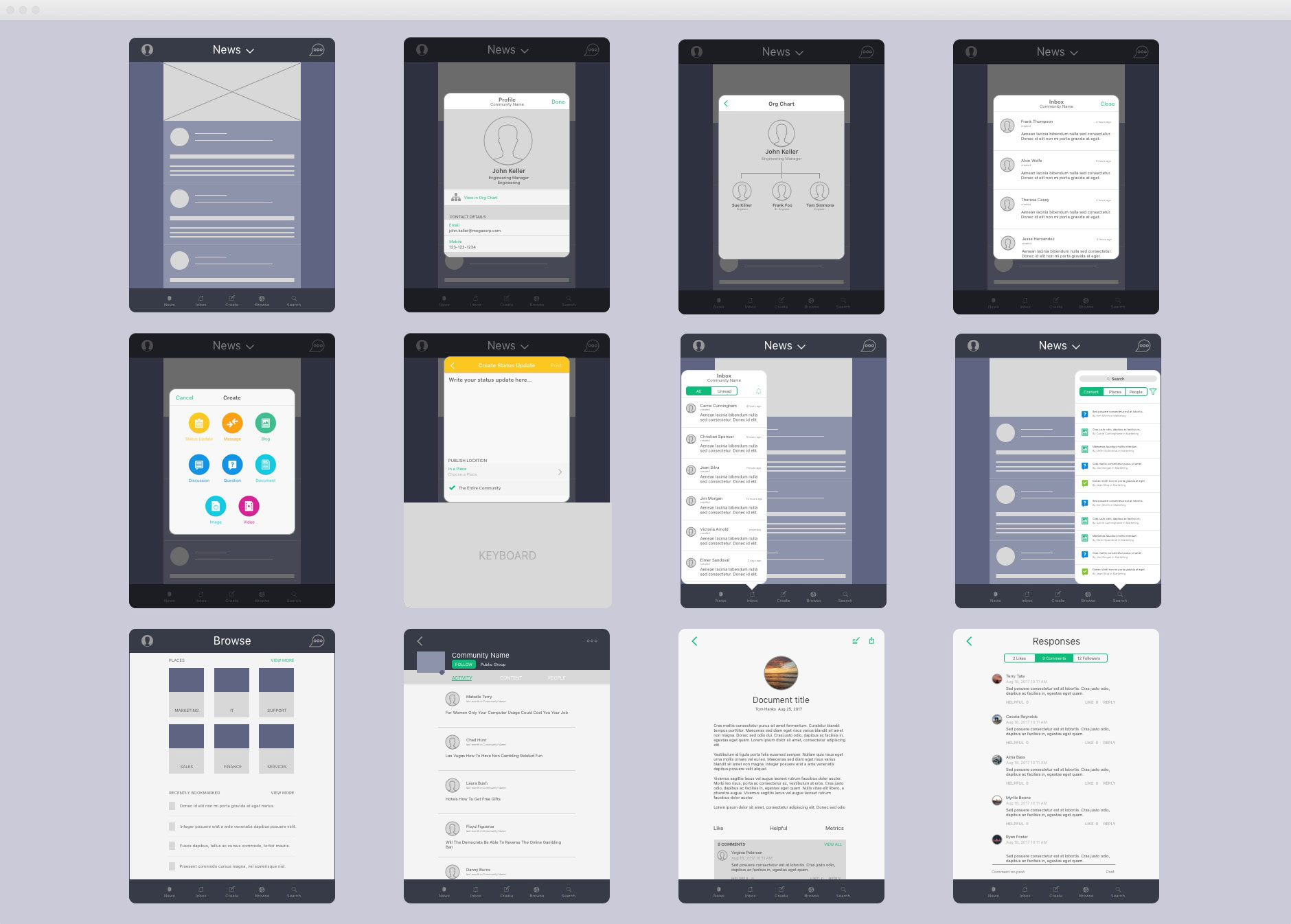
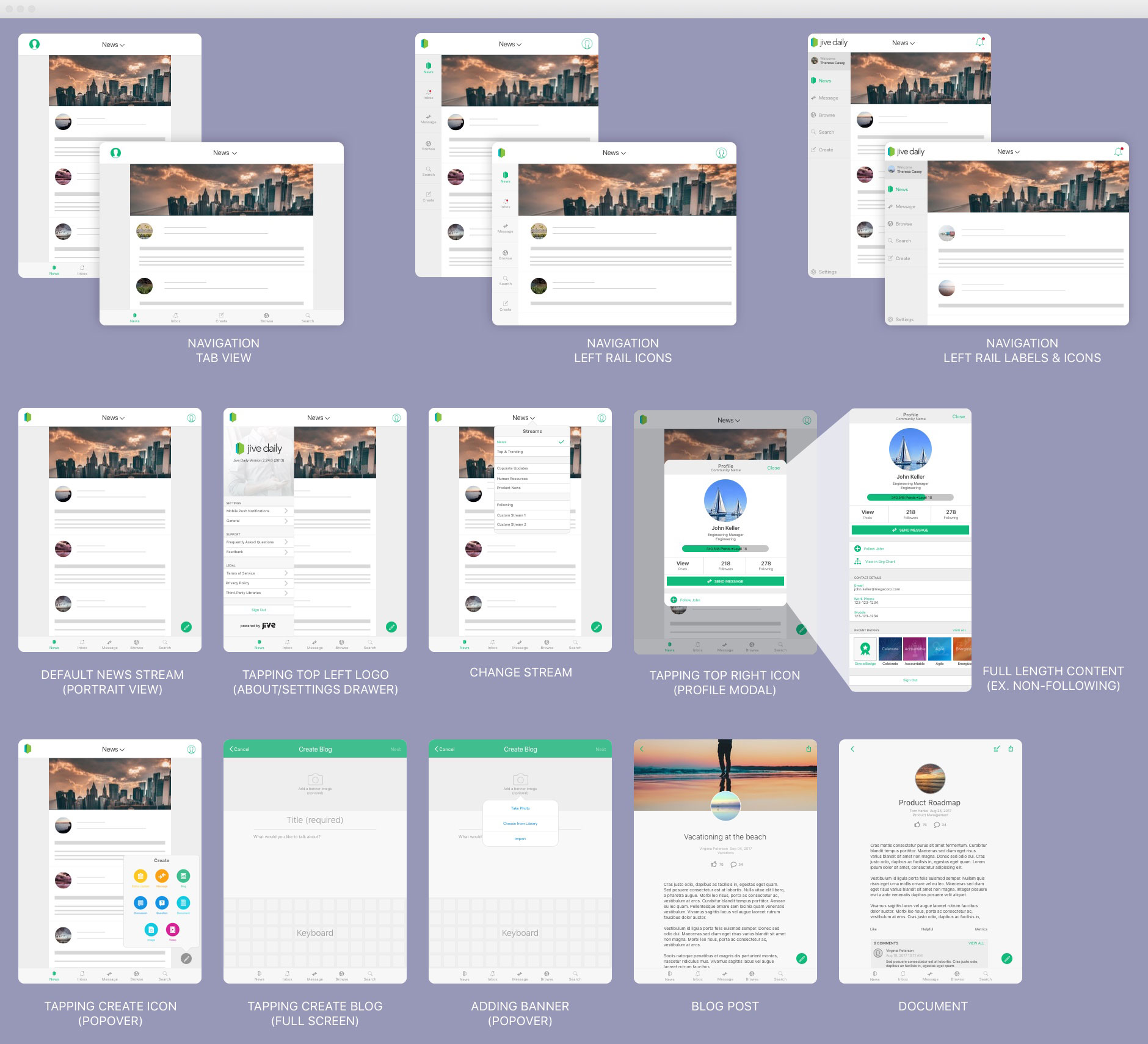
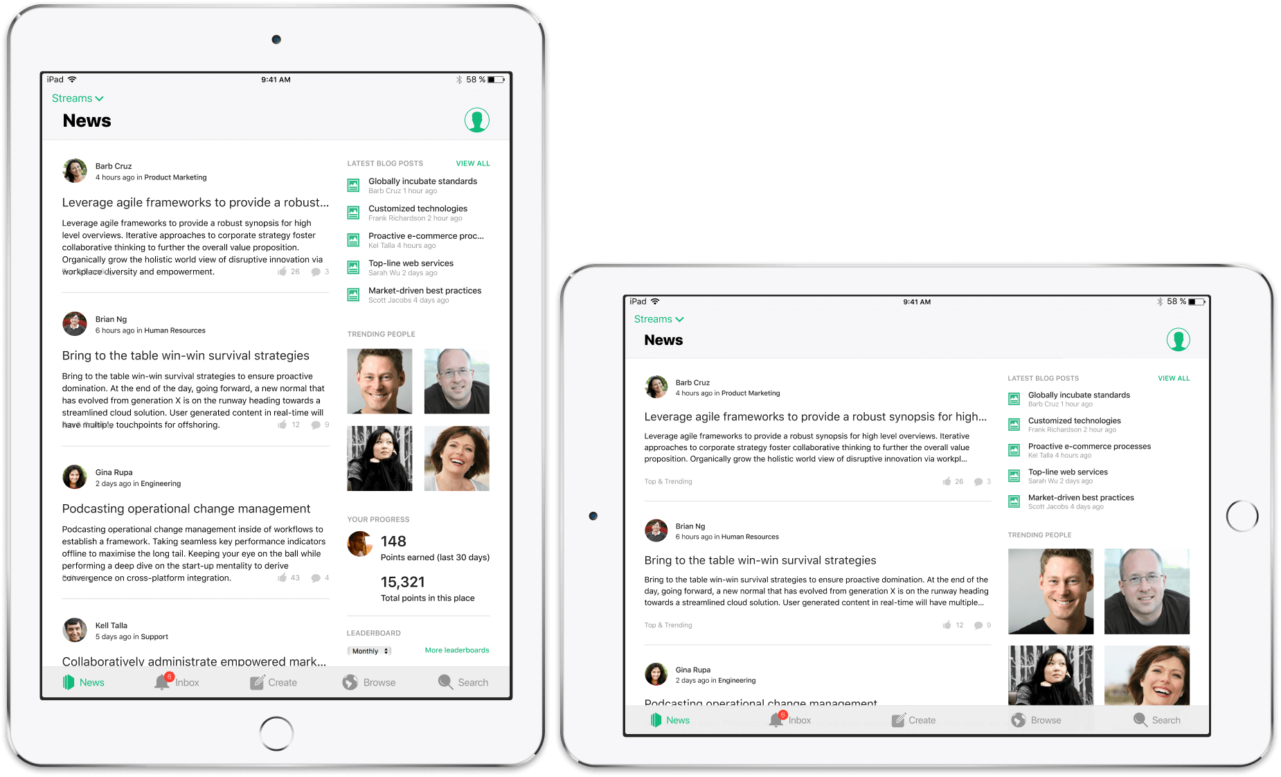
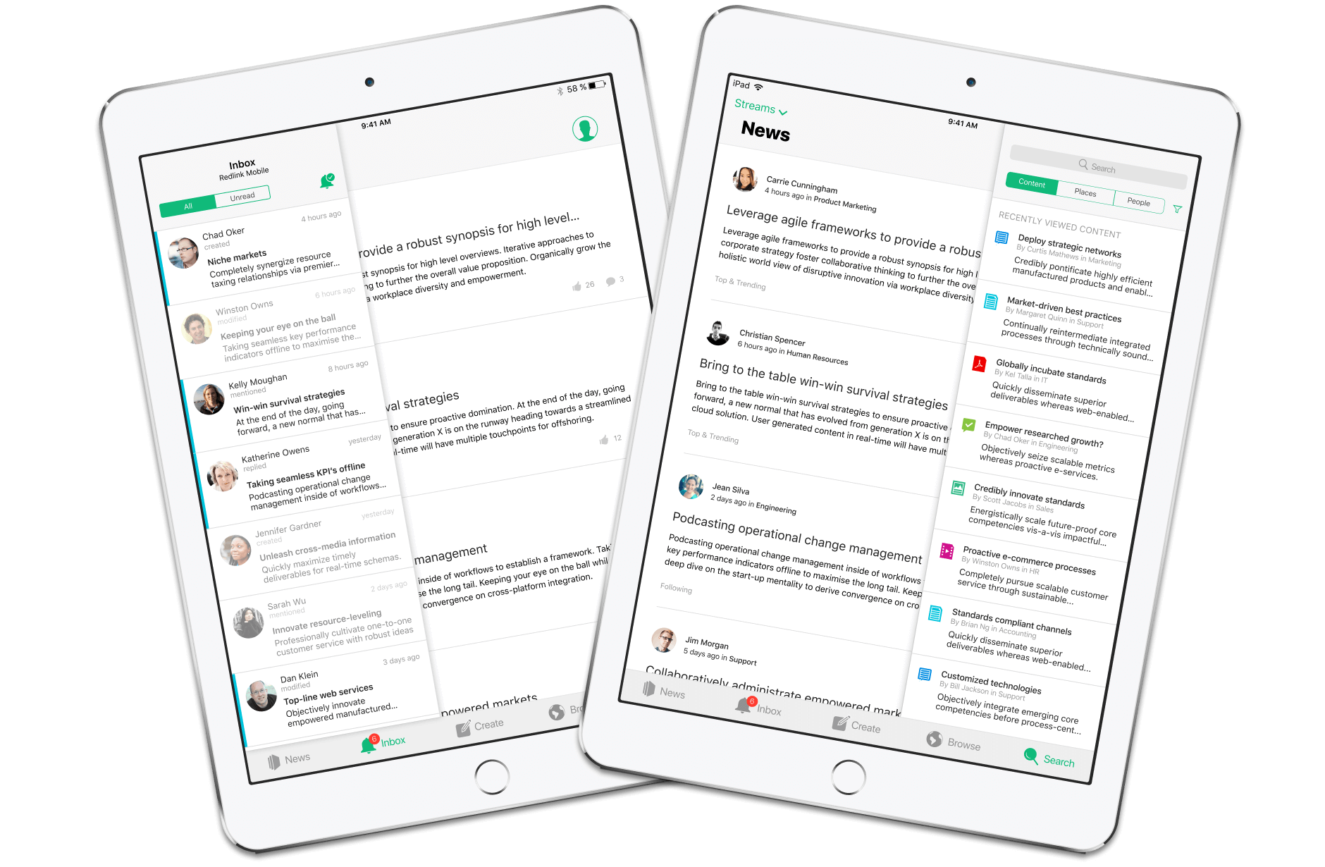
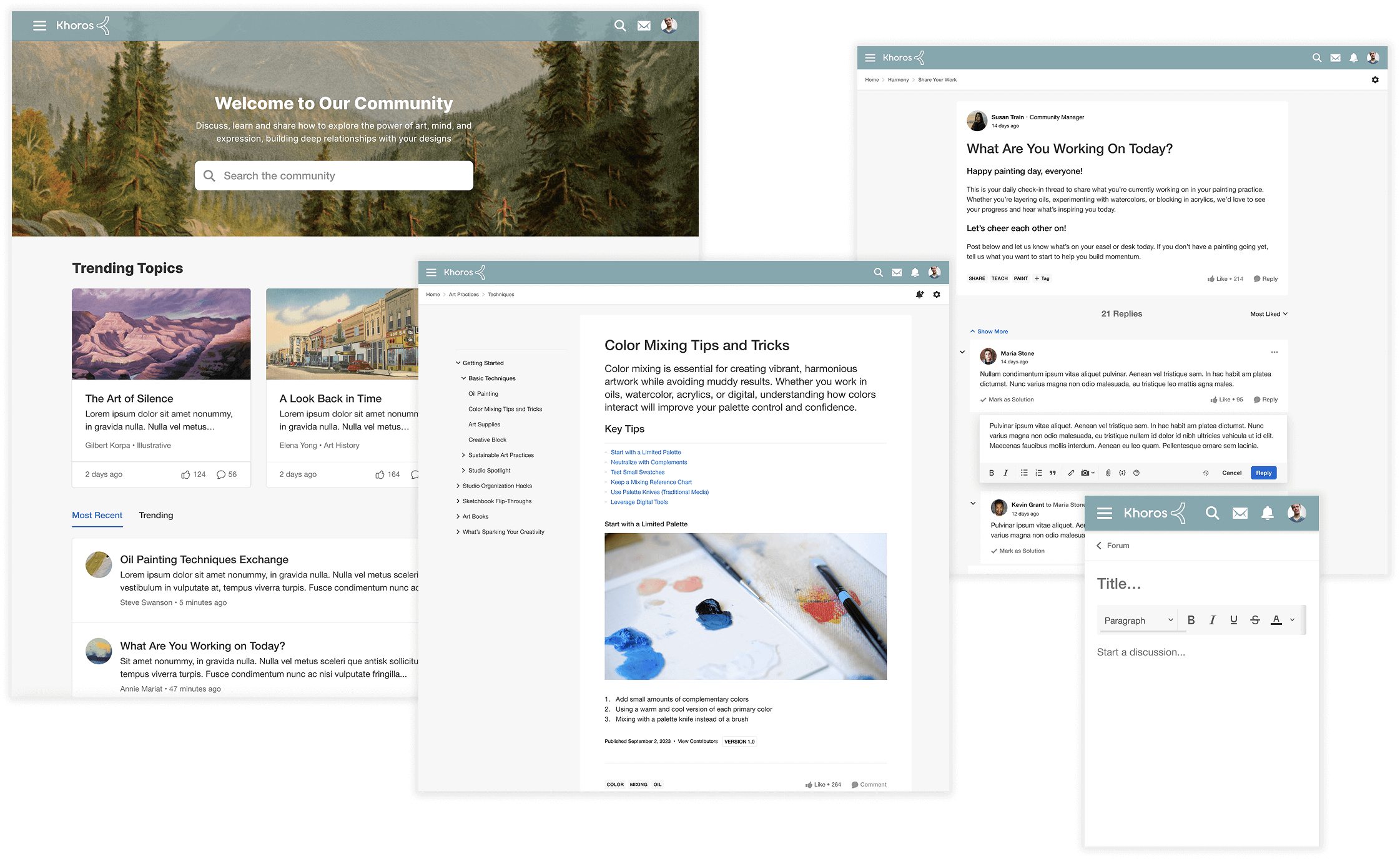
Content Creation Workflow
Content creation is at the center of how any community collaborates with each other. I strived to design the create experience to be as close as possible to the published experience by keeping consistent spacing, font styling, and overall layout structures so that no surprises would appear to the author once the content was published.
Challenge: Very form driven data entry, data entry spread out, a lot of bouncing around.
Solution: All content entries display in place, size and layout as it will be when published; clearly sectioned content areas.

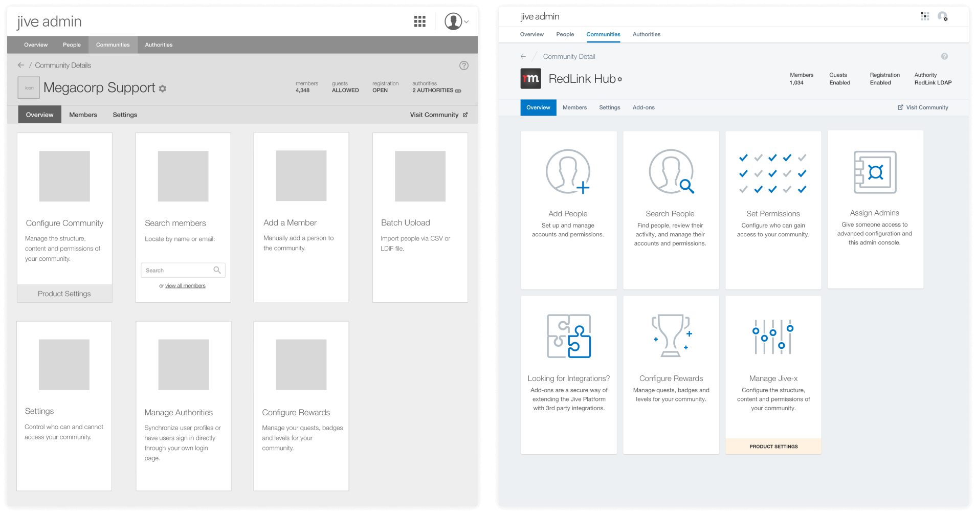
Managing Content & Moderation
This feature included combining what was multiple dashboards and hidden boards in various locations in classic community to one new centralized content management dashboard, where users could perform all tasks related to content moderation, including managing content drafts and reviewing spam and abuse reports on content.
Challenge: Multiple dashboards scattered around the community, some hidden, limited features; difficult to manage moderation.
Solution: One central location for all dashboards, multiple tasks a click away to moderate and manage content.

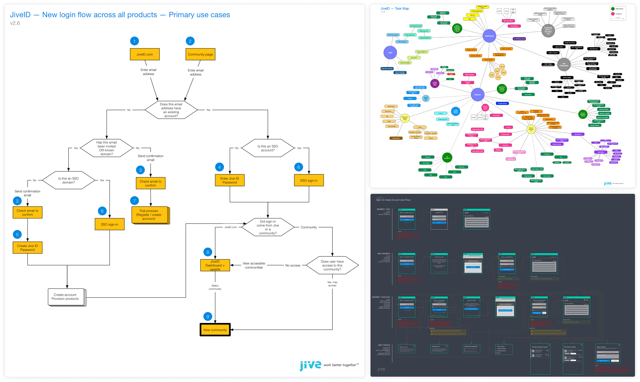
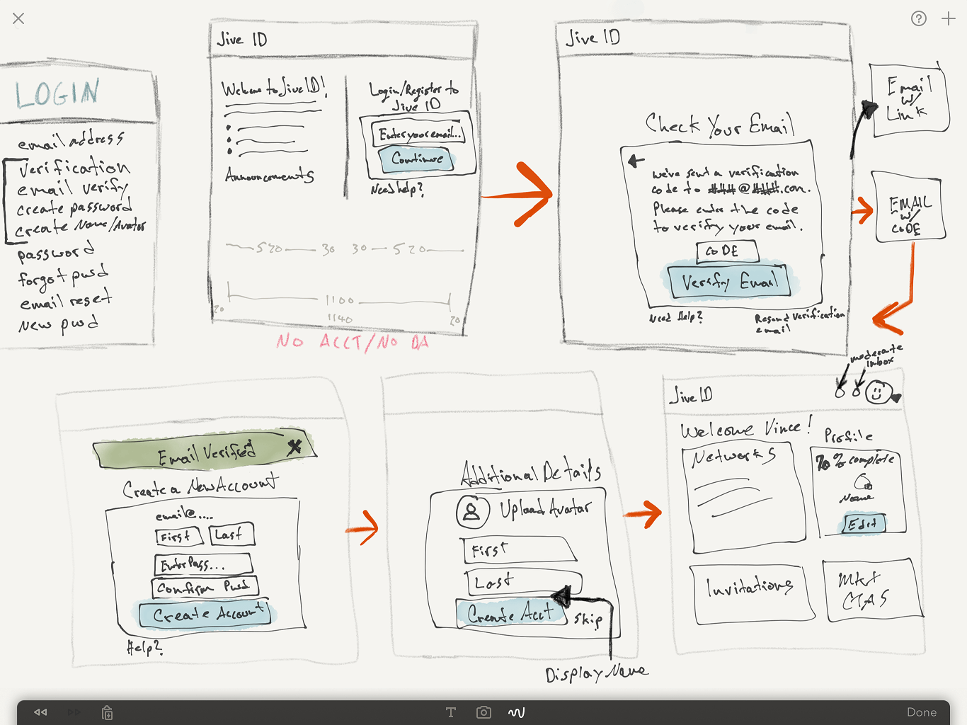
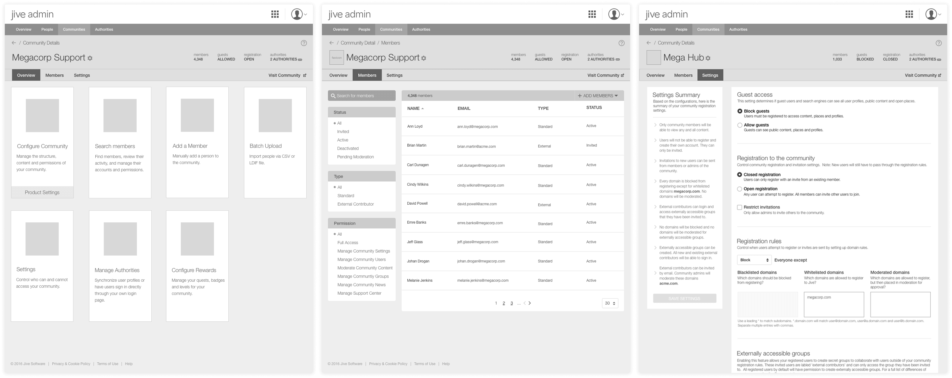
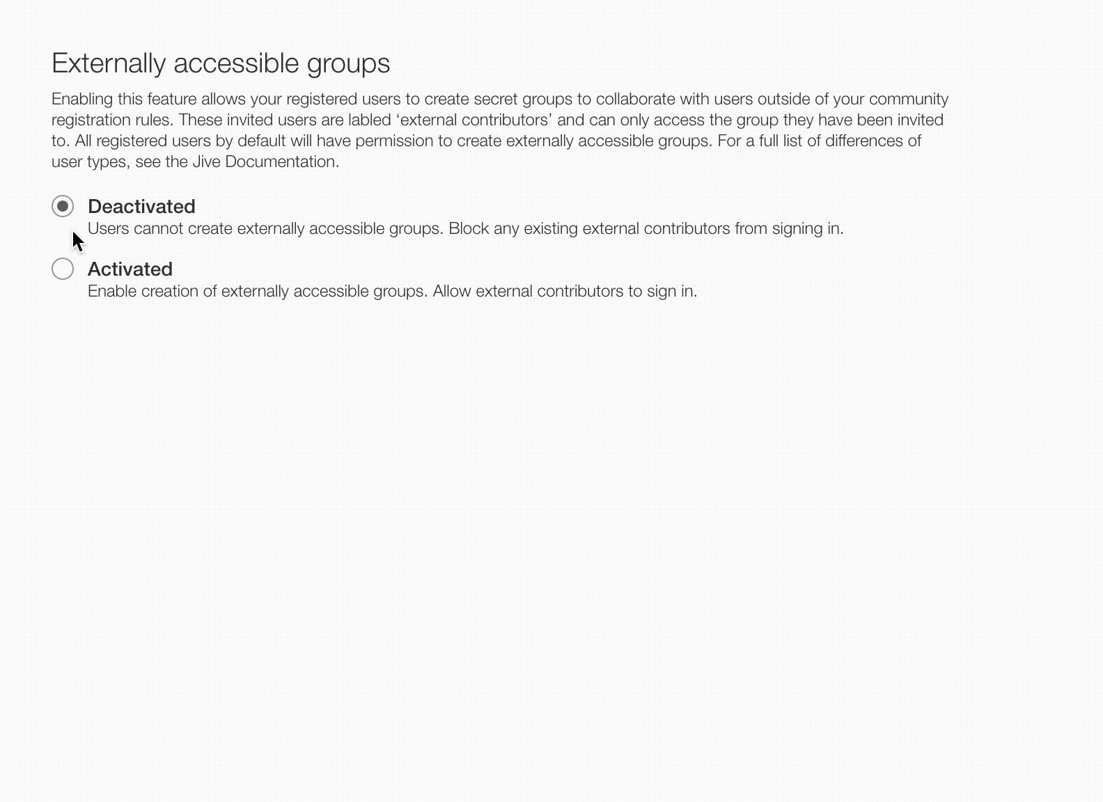
Simplifying Authentication
Rethought the end-to-end experience for how new and existing members authenticate into the platform. A lot of research and exploration was put into this stage to help define our forms engine, required and optional field sets, and validation states. I also created a new experience to give admins the ability to self-configure not only the sign-in experience for the customer, but also the ability to configure different types of SSO auth methods that talked to the customers SSO, where in the classic community this was configured through back-end configurations that Support or Services had to help customize with the customer.
Challenge: Customization required for mixed authentication methods, long forms causing registration drop-offs.
Solution: Simplify authentication forms, introduce self-serve configurations to eliminate costly customizations.

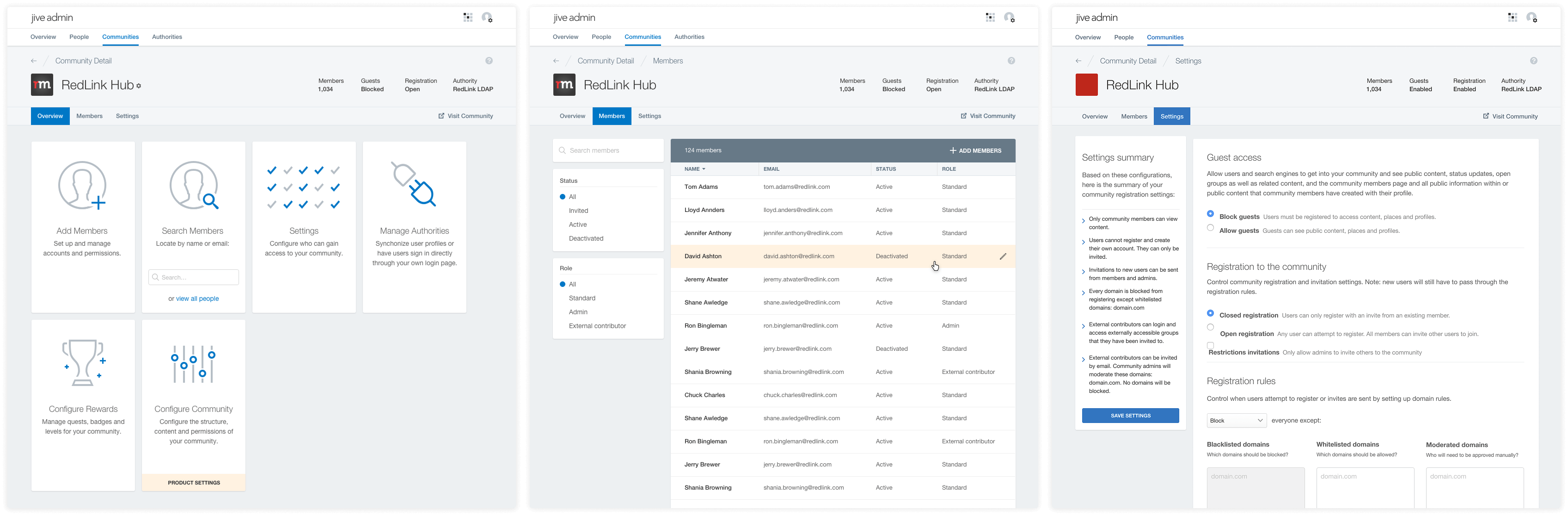
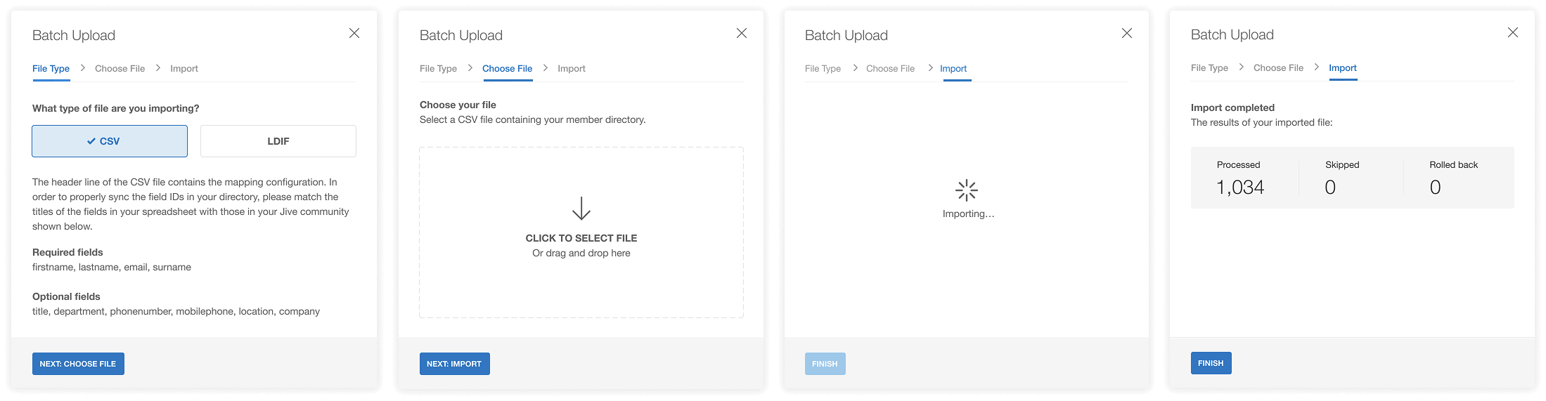
Admin Configuration Experience

Structuring Knowledge Base Guides
KB Guides was a brand new feature to the platform that provided a way for community managers to host and provide structured navigation to other articles within the community. I brought a simple yet powerful way to structure articles inside sections that gave the viewer access to relevant content effortlessly. This feature introduced a configuration dashboard to add guides, chapters, and articles as well as widget configurations to display different paths to get into a guide grouping.
Challenge: No clear navigation structure for the reader to view other KB articles. Each article had no clear path to similar articles.
Solution: Provide a user-friendly approach to presenting valuable information, making it easier for the reader to consume and find what they need in a given subject matter.

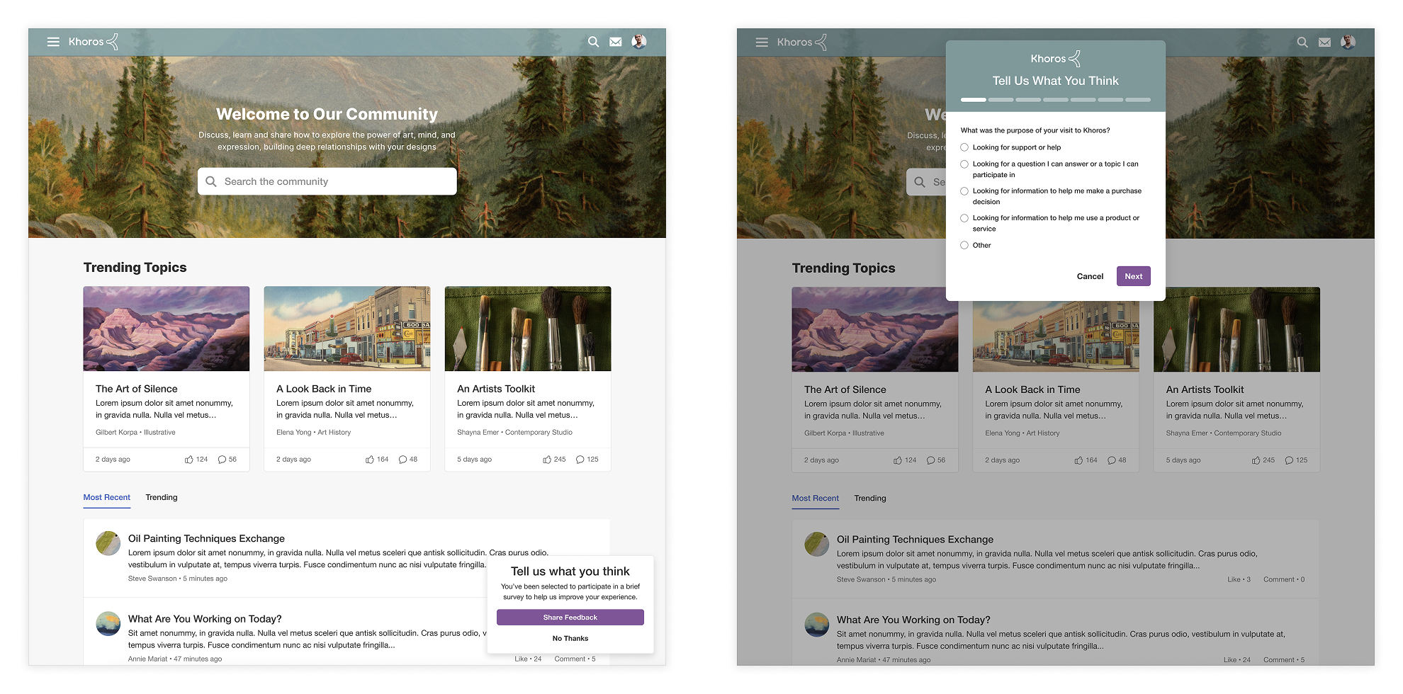
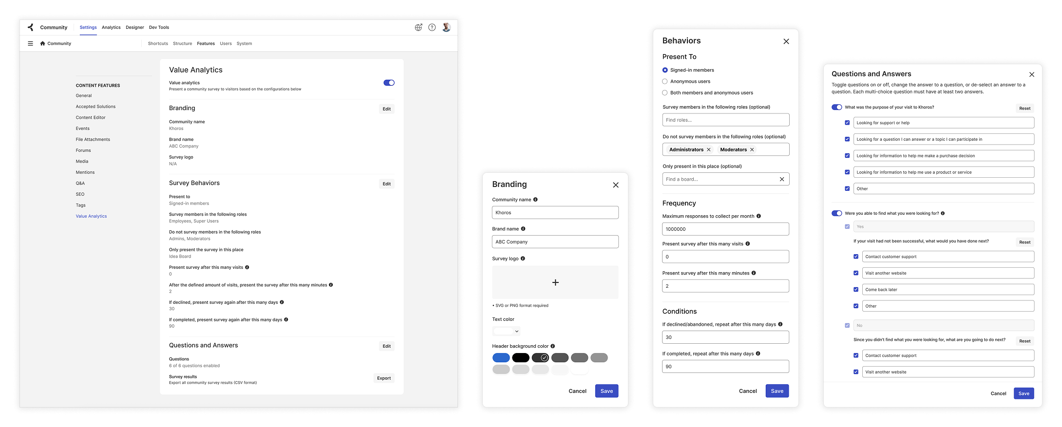
Surfacing Value Surveys
Enable customers to track NPS (Net Promoter Score) or CSAT (Customer Satisfaction Score) score via common surveys and gather feedback from their end users on their community experience. This involved an admin interface that allowed configurations to when the survey would show to question management that would be served in the survey. One big consideration was to offer the survey to the viewer in a way that didn't interrupt the flow they were trying to accomplish in the community, but to gently ask if they would mind in answering a few questions. Customers and internal Khoros teams would used this data to report on community ROI, health metrics, and overall community feedback.
Challenge: Disruptive experience for the end user, theming and when to surface the feedback prompt was a customization with the Services team.
Solution: Provide a self-service configuration allowing complete control of the design and when to and how often to ask for feedback.
Results
By applying a user-centered design process, I delivered a streamlined and refreshed community experience that improved clarity and usability for both community managers and its members. The redesigned Aurora platform not only aligned with key business goals, but also significantly enhanced the customer experience. Through research, iterative design, prototyping, and close cross-functional collaboration, I ensured my solutions effectively addressed user needs and delivered lasting impact.